YounifyBank

Simplifying Savings, Unifying Finances

Concept UX/UI Design

Overview

Duration

March – May 2023

Skills

User Research
User Testing
Prototyping
UI Design

Tools

Sketching
Figma
User Interviews

Introduction

In our rapidly evolving digital landscape,
the instant gratification of online shopping behaviours often overshadow creating sustainable financial goals and systems.

Problem Space

ASIC’s Australian Financial Attitudes and Behaviour Tracker
report reveals 22% of Australians found dealing with money to
be stressful and overwhelming.

Additionally an alarming 42% of Australians don’t frequently
check account balances, and 50% of Australians don’t believe they’re adequately informed about financial planning.

These findings suggest an opportunity for a digital product
which allows users to create a holistic, personal financial
management system.

Design Goal

Design an intuitive banking app that seamlessly integrates into
users’ busy lives, promoting clear financial understanding,
accessibility and prioritises user control of their financial goals.

Research

Approach

  1. Discover and understand hypothesised users and their financial habits through user research.

  2. Define and ideate solutions based on research findings with user-flows, wireframes, and lo-fi prototypes.

  3. Validate design direction with usability testing and higher fidelity prototypes.

Research Methodology

To begin, semi-structured interviews and surveys were conducted
to gain insights into the problem space, target audience, and their
overall attitude towards financial planning and habits across
financial management.

The aim was to understand how users perceive their finances,
identify their financial habits, and determine what tools or methods currently benefit or challenge them in managing their own money.

Define & Ideate

Key Points of Inquiry:

  1. What challenges do users face when budgeting and saving?
  2. How do users feel about their current level of control over their spending habits?
  3. What excites users about saving or spending?
  4. How successful are users in saving for specific goals?
  5. What are users’ thoughts on an automated savings process?

Figure 1.0 ‘ User Persona’ Mapping

Figure 2.0 ‘User Flow’ New Savings Bucket Diagram

Feedback

A synthesis of user research insights informed the resulting creation of a user-centric financial management solution.

Key findings, observations and insights shaped the define and ideation stages including the following highlights:

  1. Simplicity of an automated saving feature Users appreciated the simplicity and intuitiveness of the automated saving feature

  2. Tracking financial habits Users found visually seeing real-time spending data highly beneficial for tracking their habits.

  3. Customisation and personalisation The ability to customize and categorize their savings ‘buckets’ was positively received, leading to an unexpected pivot towards greater customisation options in the design.

Research Insights

  1. Many users find budgeting overwhelming, indicating a need for simplified, intuitive tools.
  2. 93% of users desire more control and visibility over their spending, highlighting the need for real-time, easy-to-understand spending data.
  3. Users expressed a desire for an automated savings process to achieve their financial goals effortlessly.

Design Development

User feedback around the design aimed to address users’ need for simplicity, control, and automated saving. Iterative testing and refinement based on user feedback led to continuous improvements for a seamless and intuitive user experience.

Figure 3.0 ‘Lo Fidelity’ Information Architecture Mapping

Figure 4.0 ‘Mid Fidelity’ Information Architecture UI Flow

User Testing Feedback

Multiple rounds of user testing provided a wealth of insight into usability issues; some of which included:

1. Accessibility

  • Prototyped chevrons were too small and lacked feedback mechanism
  • Usability issues with tapping and interaction

2. Confusing Visual Cues

  • CTA button designs used for highlighting headers caused confusion
  • Uncertainty about clickable elements

3. Lack of Feedback from the App

  • Insufficient feedback on interaction registration
  • Jarring transitions and lack of visual cues for loading states
  • Difficulty in editing payments

4. Sizing of Components

  • Account amount scale too large, privacy concerns in public use
  • Implementation of GEL sizing references for consistency

Results

Home Screen

Provides a snapshot of users’ overall financial status, with clear visibility into spending and saving data.

Payments Screen

Streamlines the payment process, offering quick links to frequent payees and an easy-to-use interface.

Bucket Creation Screen

Enables users to create custom savings ‘buckets’, select an icon for easy identification, describe the savings goals, and determine the percentage of each deposit to be saved. This screen also provides an overview of current savings goals.

Budget Tracking Screen

Offers real-time insight into spending habits, helping users to understand their financial behaviors and make informed decisions.

Key takeaways

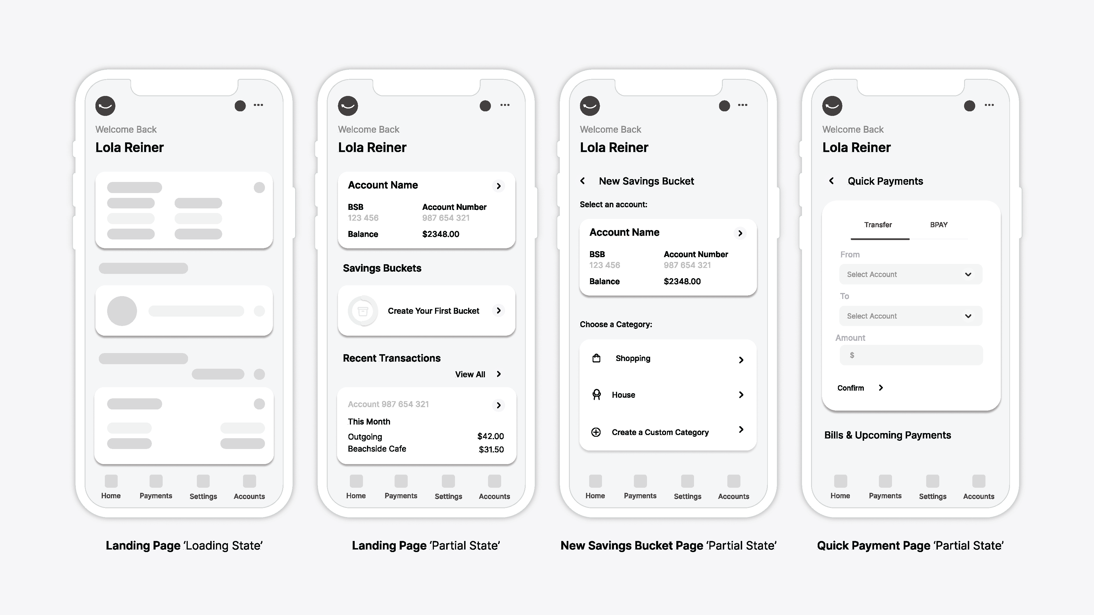
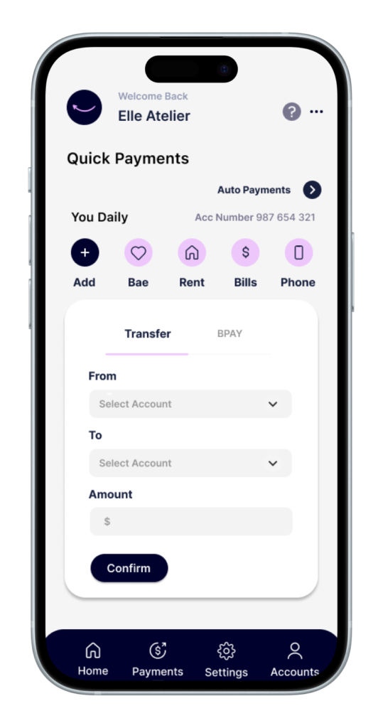
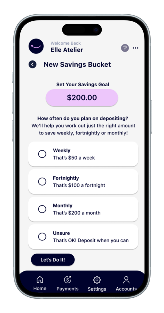
YounifyBank aims to create a website interface that is not only user-friendly but also engaging, tailored to the specific needs of its audience. The problem space revolves around designing a UI that makes it easy and enjoyable for users to save for various purposes, whether it’s a small indulgence or a significant milestone like a down payment on a house. With savings accounts on offer, the website strives to help its users achieve their goals and aspirations, no matter how big or small.